 No Menu
Andre doesn’t think that having the menu in Quick Settings iOS 7 features is a good idea. Instead you will find the edit mode that can be accessed once you pull the Settings pane up and get to the hidden feature with animated gears. This is how you can open more options from Settings. The edit mode might look a bit too flashy, yet you can find it functional too.
The designer has also made it possible to access Quick Settings from within apps as it is possible to enter this menu by shaking the smartphone. You can even edit text and access Quick Settings at the same time.
Watch the Video
Since so many people are waiting for WWDC 2013 to hear what Apple is to say about its next iOS 7 running on iPhone 5S, you can now watch the video with iOS 7 Quick Settings concept. Words can’t describe everything, and it is always better to see how it is designed to work with your own eyes.
There are some other concepts by designers who come up with various ideas what iOS 7 update should offer users. For example, Jean-Marc Denis created a concept that makes it easy to get to Bluetooth, Hotspot and Wi-Fi by swiping down on the clock [it works on the Lock screen].
Do you think Apple might adopt the concept by Moreira or should it select another idea? How do you imagine the next version of iPhone mobile operating system? We would love to hear your opinions, so voice it in the comments section below.
 Recent Blog
Ultimate Guide: How to turn Off Restricted Mode on iPhone?

Automate Apple GSX check result obtaining?

iRemove Unlock iPhone 5S, 5C, 5, SE, 4S/4 Software

MacOS High Sierra Features: Set Up Websites in Safari on Mac
How to Enable iOS 11 Mail Reply Notification on iPhone 7

How to Bypass Apple Watch Passcode Problem
LetsUnlock Services List
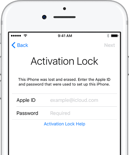
iPhone & iPad Activation Lock Bypass
Use LetsUnlock iCloud Tool to bypass Activation Lock Screen on iPhone and iPad running on iOS version up to 14.6.
Read More
Unlock Passcode Disabled iPhone or iPad
LetsUnlock iCloud Tool is ready to remove Find My and unlock your passcode disable device running on iOS 13.x.x in one click!
Read More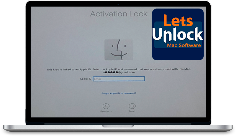
MacOS iCloud Activation Lock Bypass
The LetsUnlock Mac iCloud Activation Lock Bypass Tool will help you to remove Activation Lock on an iCloud locked Mac which is stuck on Activation Lock Screen with no need to enter the correct Apple ID and password.
Read More
Mac EFI Firmware Passcode Bypass
The LetsUnlock EFI Bypass Tool is a one button solution, which you click to start the EFI Unlock process. Bypass EFI with out password! Everything else does the software.
Read More
MacOS iCloud System PIN Bypass
The LetsUnlock MacOS iCloud System PIN Bypass Tool was designed to bypass iCloud PIN lock on macOS without passcode!
Read More